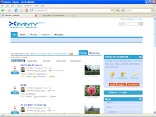
Ximmy.com's layout and feature is typical of a Web 2.0 open source content management system. It looks and feels very much like a Pligg site.
You can visit a demo Pligg site here and the Ximmy site here. I've taken screenshots of both sites below.
You can visit a demo Pligg site here and the Ximmy site here. I've taken screenshots of both sites below.


As you can see, they look very similar.
Ximmy.com most probably is a Pligg site. I have no issues with that though. I am totally for open source. There's nothing wrong with that. If people can make money using open source software and systems, the better. And, so far, I like how it works although I'd definitely appreciate some more user friendly features.
Since I joined, I've noticed that they are slowly, but surely, making some improvements in their layout and features.
The following is a run-down of most of Ximmy's layout and features including some of the latest and just activated features:
1. The Ximmy logo. On the upper left corner of almost all pages.
2. Help, Register, Login links and Search box on the upper right corner of almost all pages. This changes to Help, Profile, Logout links and Search box upon logging in the site. The Help feature is still inactive.
3. General content tabs:
5. Several side modules are available in almost all pages except the Blog site:
7. Google Adsense ads just below the general content tabs, and another below the Top Today side module. I only noticed the ads about two to five days ago.
I noticed that a lot of changes to the layout and features are made on the fly. I mean one second there's nothing there and then all of a sudden it just pops out.
So far, so good. If Ximmy is a Pligg site, so what!!! As long as it keeps on improving, in terms of what they can offer their members, well, It's fine with me.
Ximmy.com most probably is a Pligg site. I have no issues with that though. I am totally for open source. There's nothing wrong with that. If people can make money using open source software and systems, the better. And, so far, I like how it works although I'd definitely appreciate some more user friendly features.
Since I joined, I've noticed that they are slowly, but surely, making some improvements in their layout and features.
The following is a run-down of most of Ximmy's layout and features including some of the latest and just activated features:
1. The Ximmy logo. On the upper left corner of almost all pages.
2. Help, Register, Login links and Search box on the upper right corner of almost all pages. This changes to Help, Profile, Logout links and Search box upon logging in the site. The Help feature is still inactive.
3. General content tabs:
ALL, NEWS, VIDEOS, PICTURES AND WEBSITES.
4. Each general content tab has sub tabs below, except for the ALL tab.5. Several side modules are available in almost all pages except the Blog site:
Ximmy Social Network
Submit to Ximmy
Menue
Affiliate Program
Top Today
Up Coming
Latest Comments
Top 30 Tags
6. The Footer module which has links to details and other site features. Some of the latest additions here are the newer Join and Login links.Menue
Affiliate Program
Top Today
Up Coming
Latest Comments
Top 30 Tags
7. Google Adsense ads just below the general content tabs, and another below the Top Today side module. I only noticed the ads about two to five days ago.
I noticed that a lot of changes to the layout and features are made on the fly. I mean one second there's nothing there and then all of a sudden it just pops out.
So far, so good. If Ximmy is a Pligg site, so what!!! As long as it keeps on improving, in terms of what they can offer their members, well, It's fine with me.


No comments:
Post a Comment